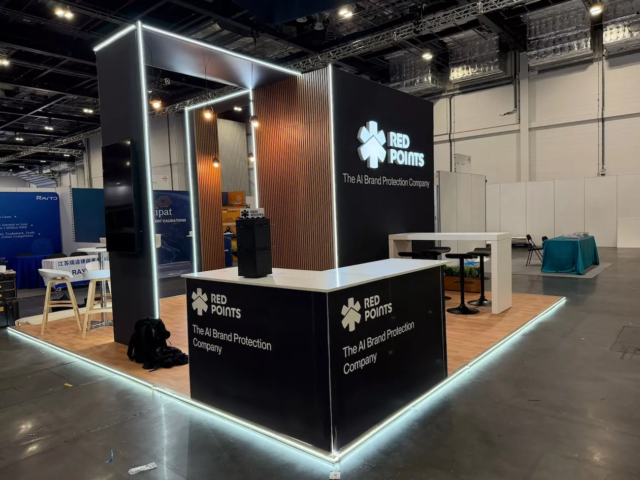
Walk any exhibition hall floor, and you'll see the same problem repeated fifty times over: stands that look expensive but say nothing, and stands so cluttered visitors walk straight past. Good exhibition stand design isn't about spending the most. It's about making a visitor's decision to stop and talk to you feel effortless.
Whether you're planning your first show or refreshing a stand you've used for years, these 20 ideas will help you design something that actually earns attention on the day, not just admiration in the render.
Before getting into specific ideas, it's worth being clear on what "good" actually means here. A strong exhibition stand does three things at once: it's visible from a distance, it communicates who you are within about three seconds, and it gives visitors an easy, low-pressure way to start a conversation. Everything else (materials, lighting, tech, giveaways) exists to support those three jobs. If a design choice doesn't help with one of them, it's decoration, not strategy.
Every solid exhibition stand design starts with a short list of essentials, decided before a single sketch is drawn:
Skip any of these, and even a beautifully designed stand will underperform.
1. Open corners, closed backs: Design your stand so at least two sides are open to the aisle. Closed-off box designs feel like a barrier, not an invitation, and visitors have to actively choose to walk in, rather than naturally drift in.
2. Design a "pause point," not just a walkway: Give people a reason to stop before they reach your team: a product on a plinth, a screen, a single striking graphic. It buys your staff a few seconds to make eye contact and open a conversation naturally.
3. Keep sightlines low: Anything above 1.5m should be minimal: logo, hero graphic, maybe a hanging banner. Visitors scan a hall at eye level and below; towering structures help with visibility from afar but can make a stand feel closed-in once someone's actually standing in it.
4. Zone your space by purpose: Separate "browse" areas from "meeting" areas, even in a small footprint. A visitor who just wants to grab a brochure shouldn't have to walk past a private conversation to do it.
5. Use LED to define shape, not just brightness: LED strip lighting along edges and shelving does more for perceived design quality than overhead floodlighting. It's also one of the more affordable upgrades for a modular exhibition stand.
6. Match lighting temperature to your brand: Warm white (around 3000K) feels approachable and premium; cool white (5000K+) feels clinical and tech-forward. Pick based on your industry, not just what looks bright.
7. Light your product, not your walls: If you're exhibiting a physical product, a single well-aimed spotlight on it will outperform a fully lit backdrop every time. Contrast draws the eye.
8. Choose modular if you exhibit often:: Modular exhibition stands can be reconfigured for different hall sizes and reused across multiple shows, which makes them the more cost-efficient option for brands doing three or more events a year.
9. Choose custom if the stand is the message: Custom exhibition stands make sense when the design itself needs to communicate something modular systems can't: an unusual shape, a fully branded environment, or a stand-out architectural feature that becomes part of your brand story at the show.
10. Consider a hybrid approach: Many of the best-performing stands use a modular frame with custom-fabricated feature elements, giving you reusability where it doesn't matter and impact where it does. Eventfull's custom event stands are built with exactly this kind of flexibility in mind, whether you need a fully bespoke structure or a hybrid build.
11. Don't underestimate a portable exhibition stand: For smaller shows or secondary events, a well-designed portable stand can look just as sharp as a full build, and can be set up by two people in under an hour.
12. Design pop-up graphics for a 3-second read: Portable stands often rely on fabric or roller graphics. Keep text minimal; one headline, one visual, done. Anyone walking past should absorb the message before they've walked past it.
13. Build in flexibility for different room shapes: A good portable design works whether you've got a 2x2m corner slot or a 4x2m island. Test your graphics and structure against both before the show, not on the morning of.
14. Choose reusable materials over disposable ones: Beyond the sustainability angle, reusable structural elements reduce your cost-per-show over time, especially for exhibition stand design used across multiple events per year.
15. Mix textures, not just colours: Timber, fabric, and matte versus gloss surfaces read as "designed," while flat, single-material builds read as "budget," even at the same production cost.
16. Give visitors something to do, not just look at: A simple interactive screen, a live product demo, or even a short quiz gives visitors a reason to stay longer than the average 15-second glance.
17. Design a photo-worthy moment: One well-lit, well-branded spot people want to photograph does more for brand recall (and social reach) than an entire stand of tasteful branding.
18. Staff placement matters as much as stand design: Even the best trade show booth design underperforms if staff cluster at the back or stand with arms crossed near the entrance. Position your team to be visible but not blocking.
19. Use height to signal from a distance, then simplify up close: Tall structural elements or hanging signage help visitors find you from across the hall; once they're at the stand, the message should simplify to something conversational, not still shouting from a banner.
20. Plan for the follow-up before the show starts: Build lead capture into the design itself: a scanner station, a simple sign-up screen, a clear space for business cards. The design job isn't done until there's a system for what happens after someone stops by.
Once you've settled on a direction, a short planning pass will save you from last-minute surprises:
The strongest exhibition stand designs aren't the ones that win awards for looking impressive in a portfolio. They're the ones that make a stranger, mid-walk across a busy hall, decide to stop. Get the fundamentals right (visibility, message, and an easy way in) and the rest of the design decisions become much easier to make.
If you're planning your next stand and want a second pair of eyes on the design before you commit, take a look at Eventfull's custom event stands, or explore whether a modular or custom-built approach fits your next event best. We can help you get it right the first time.